2025
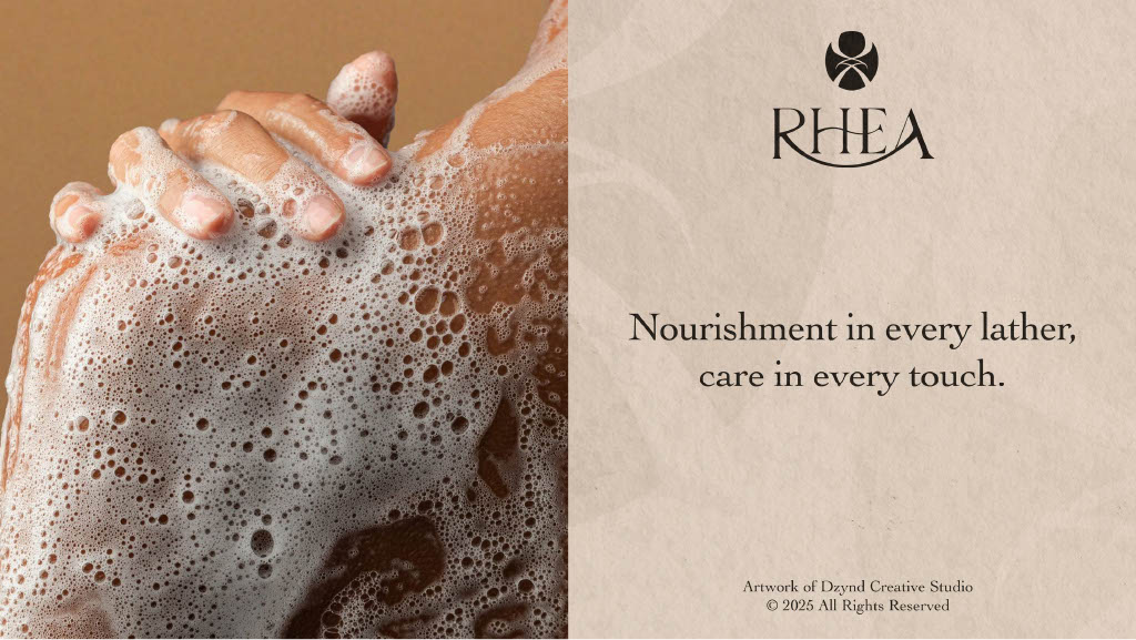
Rhea
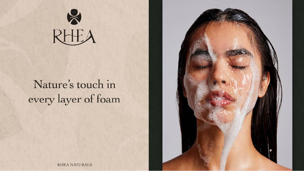
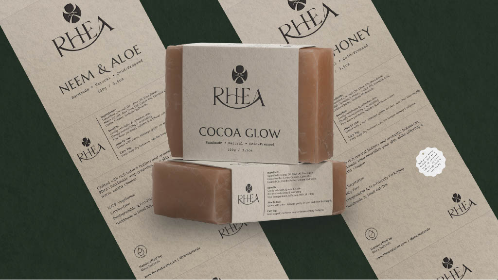
RHEA is built for the ritual, crafting artisanal handmade soaps engineered for mindful moments and everyday elegance.
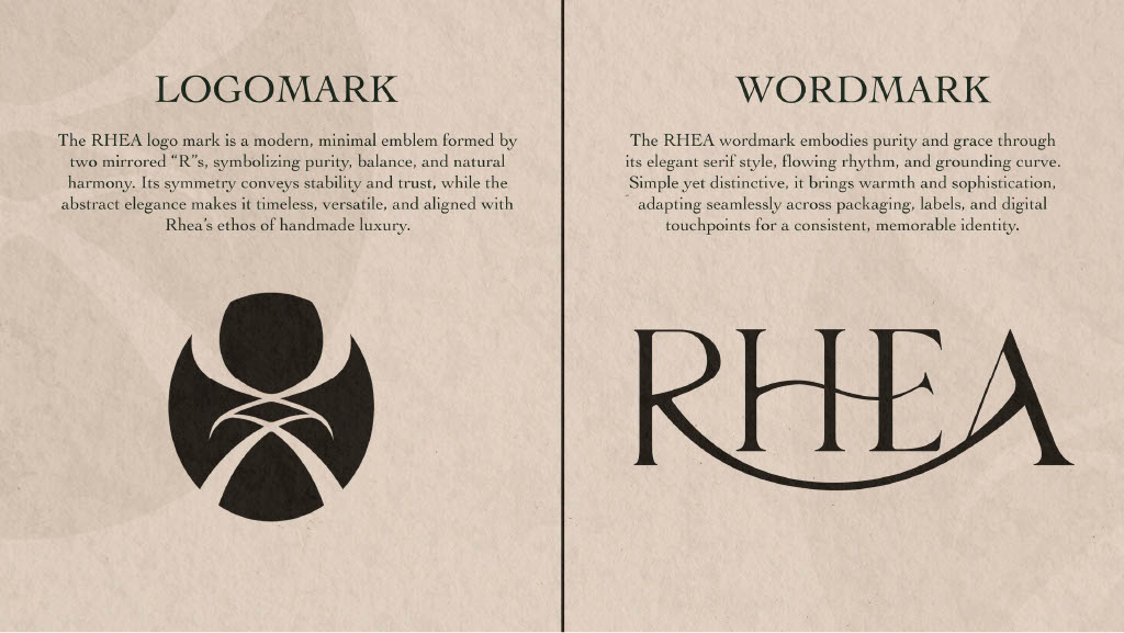
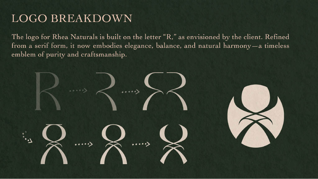
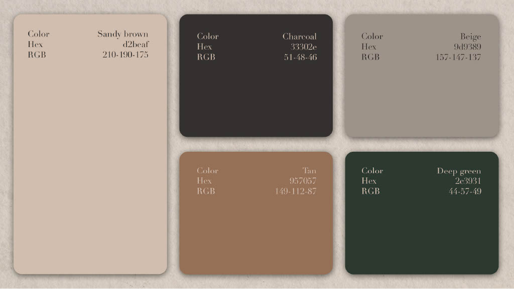
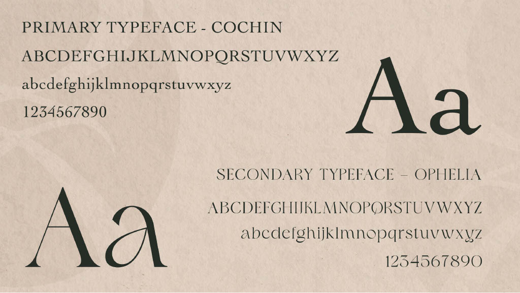
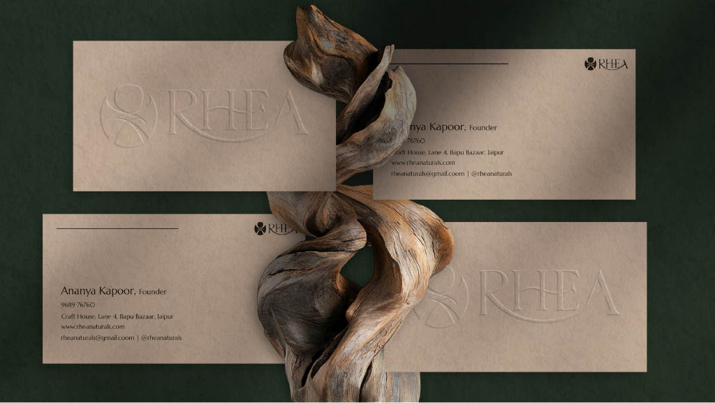
We started with the essence of nature, creating a minimal, mirrored logomark, elegant serif typography, and a grounded color palette that reflects the harmony of raw ingredients. Every visual element was crafted to mirror balance, grace, and the soul of "Quiet Luxury."

Client
2025
Timeline
6 weeks
Service(s)
Visual Identity
Project goals
The goal was to create a digital experience that reflects RHEA’s purity, balance, and quiet luxury. From the visual identity to the interface, every element was built to evoke a sense of calm and guide users through the brand’s artisanal story with a gentle, intuitive flow.
Beyond the aesthetic, the focus was on authenticity, storytelling, and sensory connection—ensuring the brand’s commitment to natural harmony is felt at every touchpoint. The design provides a scalable and elegant framework that allows RHEA to grow while maintaining the intimate, "handmade" feel that defines its soulful character.


Result
Since the brand’s introduction, RHEA has experienced a significant shift in market perception—notably through higher customer engagement and a stronger resonance with the "Quiet Luxury" audience. The refined visual identity and cohesive storytelling have established a premium presence that attracts a discerning clientele who value authenticity and artisanal craftsmanship.
Beyond the aesthetic transformation, the project provided RHEA with a clear, soulful framework for how the brand exists in the digital and physical space. The new design system simplifies the rollout of new product lines, ensures consistent messaging across all touchpoints, and provides the foundation for sustainable growth while keeping the brand's "handmade" heart at the center.


More works

4.5 / 5
We’ve guided 20+ businesses toward success, and we’re ready for yours.